


.avif)
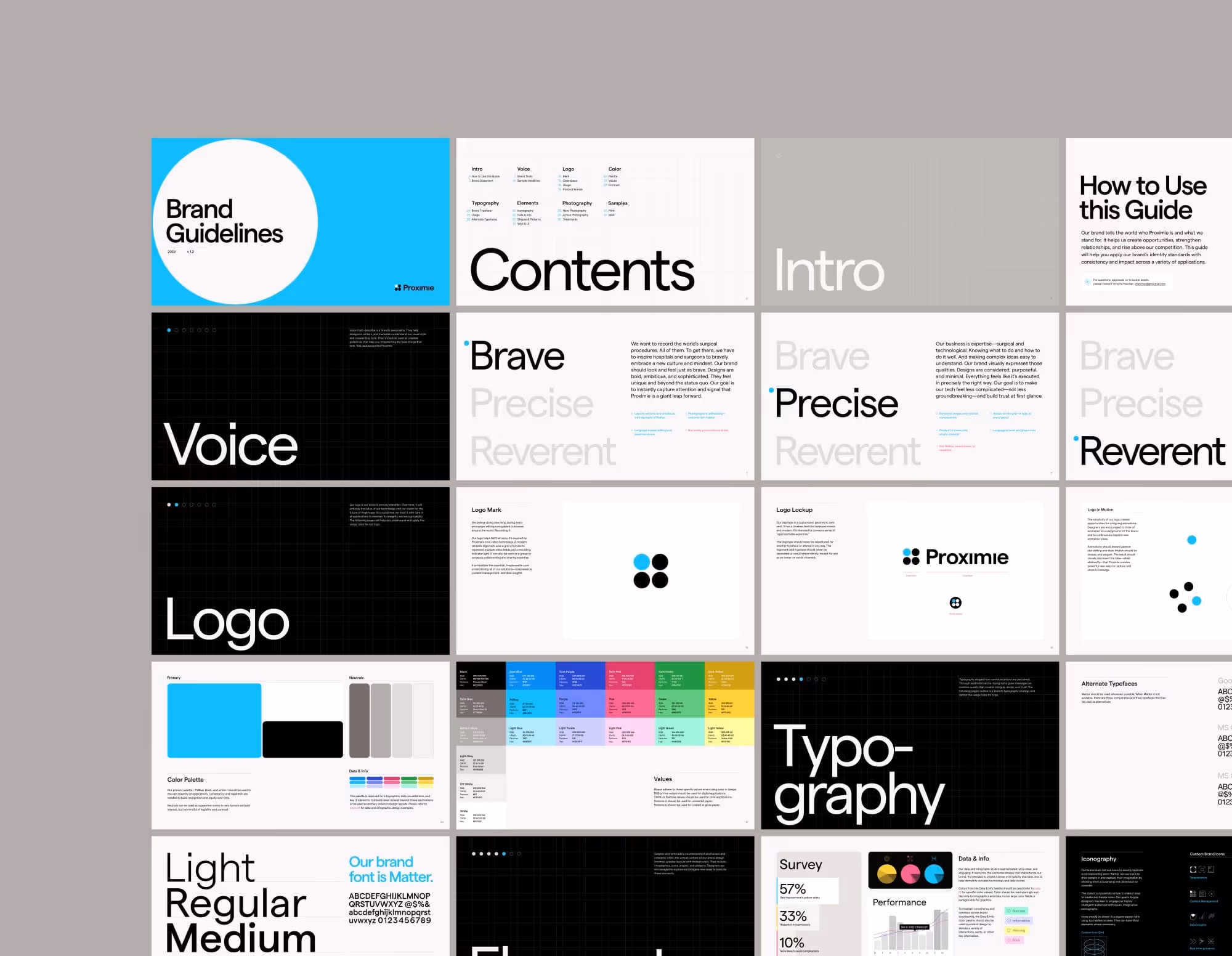
Branding the OS for the OR.
Proximie digitizes operating rooms to connect surgical teams, capture insights, and improve efficiency and care. We designed a new brand and lead-gen website to help Proximie scale adoption across large hospital systems.
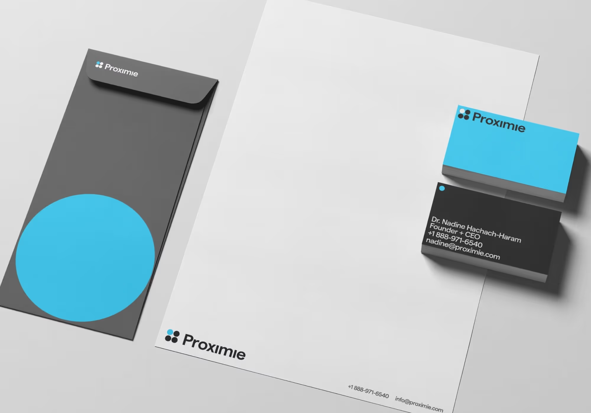
The four-dot logomark symbolizes teams, tools, and data working in sync, with the blue dot representing Proximie’s video-powered intelligence.
We dug into hospital cultures in the US and UK, uncovering barriers to adoption and the role medical device companies play in driving change. This laid the groundwork for the new "OS for the OR" positioning.
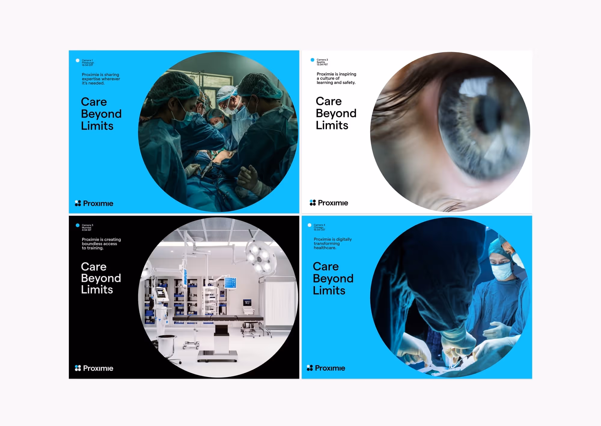
The pattern system is built from overlapping circle forms—echoing the logo and evoking focus, connection, and flow. It flexes to create subtle backgrounds to bold compositions.
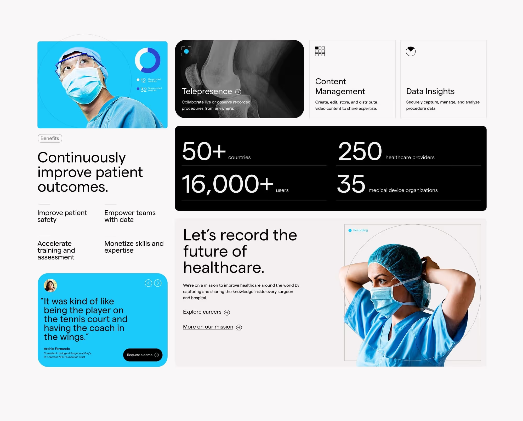
We built UI components for the marketing site and the product. Each element embodies the brand’s clarity and precision, reinforcing Proximie’s position as the OS for the OR.
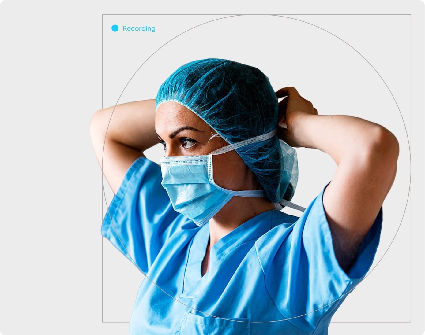
The visual identity uses sharp layouts and restrained color to make complex tech feel simple. Minimal and precise, it helps quickly earn the trust of time-crunched medical pros.
Elegant micro-interactions and open layouts create a premium site experience. Navigation, copy, and visuals show how Proximie works, and an intuitive CMS makes it easy to evolve as the platform grows.
Our brand system informed not just marketing, but product. Our UI direction shaped the look and feel of the platform itself, creating brand cohesion across every touchpoint.